I am not going to sugarcoat this: I am a statistician, and I believe a good deal of what we call “data science” has to do with statistics and statistical thinking!
But then again, I have been around for some time, and have collaborated enough with computer scientists, mathematicians, biologists, neuroscientists, physicians, and education experts to know that while statistics is very, and I mean VERY, useful in tackling big-time data science problems, its applicability and robustness are greatly amplified when it draws strength from the approaches practiced in CS, the hard sciences, Math Ed, philosophy, and many other disciplines.
One thing I learned from many years of teaching data analysis in the classroom is that intuition is a magnificently powerful engine.
The other day I was attending this cool workshop where the magnificent instructors introduced us to this super awesome website: UCSF Health Atlas.
And let me tell you something: once you enter that site, the teacher in you immediately goes into self-drive mode.
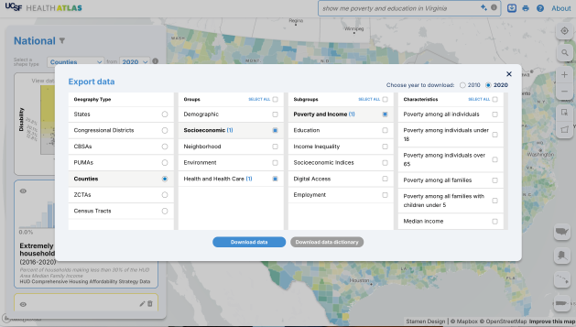
You start zooming in and out of maps, changing variables, comparing counties, switching color palettes, checking rates, spotting patterns, and before you know it, you have exported half the database onto your laptop.
And that’s exactly what happened to me.
I downloaded every file I could get my hands on.
And then the fun really started.
I began poking around the files like a raccoon that had just discovered an unattended Costco dumpster.
Some variables immediately jumped out at me. Educational attainment. Preschool enrollment. Poverty indicators. Disability prevalence.
Now listen, before we go any further, let me clarify something important.
Data scientists are professionally trained overthinkers.
You see one variable and your brain says, “nice.”
You see two variables and your brain says, “hmmmm.”
You see six variables and a map, and suddenly you’re Sherlock Holmes wearing cargo shorts and debugging R code at 2:17 in the morning.
One thing led to another, and before I knew it, I had settled on a simple question:
Do counties with lower educational opportunity and higher economic vulnerability also tend to show higher disability prevalence?
Notice something very important here.
I did NOT begin with a sophisticated statistical model.
I began with curiosity.
That, my friends, is a huge part of data science.
The statistics come later. The machine learning comes later. The fancy words come later.
But first comes the “I wonder if…”
And that little sentence is incredibly powerful.
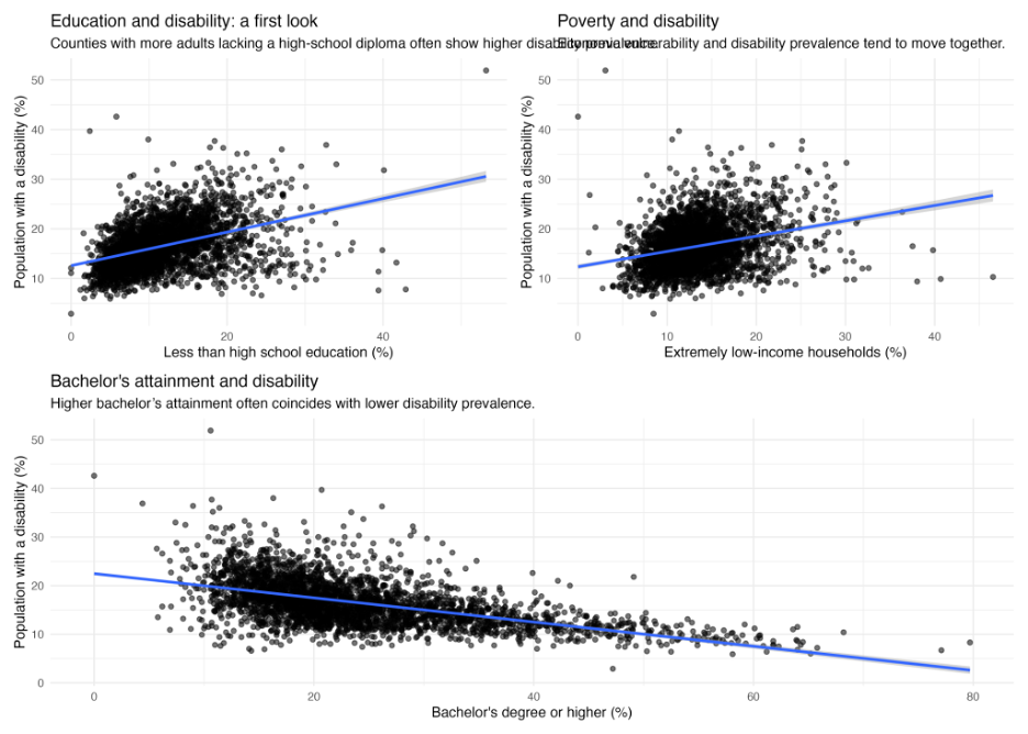
Disability prevalence versus educational attainment and poverty indicators.
The first thing I wanted to see was how these variables behaved individually across the country.
A couple of things immediately became apparent. Disability prevalence across U.S. counties is not uniformly distributed. Neither is educational attainment. Some counties exhibit dramatically higher rates of adults lacking a high-school diploma, while others show substantially higher bachelor’s degree attainment.
Already, your intuition starts whispering to you.
The scatterplots and correlation maps reinforced the visual patterns. Counties with higher percentages of adults lacking a high-school diploma tended to exhibit higher disability prevalence. Counties with higher proportions of extremely low-income households also tended to show elevated disability prevalence.
But the strongest visual relationship appeared to involve bachelor’s degree attainment. The relationship was strikingly negative.
At this point, however, the maps started telling an even more compelling story.
And THIS is where data science becomes essential.
Clusters of elevated disability prevalence appeared throughout portions of Appalachia and the rural South. Similar spatial clustering emerged for low educational attainment and economic vulnerability.
Now naturally, the statistician in me couldn’t resist fitting a model.
Actually several models.
First, I constructed a simple socioeconomic vulnerability index combining poverty burden, lower educational attainment, and weaker preschool enrollment indicators.
The relationship was remarkably clear. Counties with greater socioeconomic vulnerability tended to exhibit substantially higher disability prevalence.
Next, I fitted a standard multiple regression model predicting disability prevalence from poverty and educational indicators. The model explained approximately one-third of the county-level variation in disability prevalence.
But then came my favorite part.
The spatial model.
The spatial generalized additive model substantially improved predictive performance, explaining over half of the observed variability in disability prevalence.
And perhaps even more interestingly, the residual maps and Moran’s statistics still revealed remaining spatial structure.
Translation?
Even after accounting for education and poverty, geography was STILL trying to tell us something.
That is one of the deepest lessons in all of data science.
Good analyses rarely “finish” a problem.
Instead, good analyses reveal better questions.
And that may be the coolest part of the whole thing!
Geographic patterns in disability prevalence, education, and poverty.
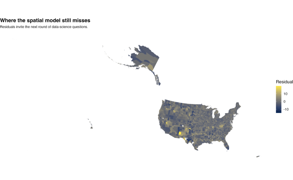
Residual geographic structure after spatial modeling.
Leave a Reply