Teaching Moment: So, What Exactly Is the Lesson Here?
Now if you’re an instructor, and especially if you teach statistics, data science, public health, sociology, economics, geography, or honestly any subject where data show up wearing a fake mustache pretending to be “objective truth”!
And the beautiful thing is that students do not need an advanced knowledge in machine learning to participate in meaningful data science.
That point is important.
Far too many students think data science begins when somebody starts throwing around terms like “deep neural networks,” “transformers,” or “Bayesian hierarchical spatiotemporal latent processes with adaptive priors.”
Listen.
Most students are still trying to remember where they saved the CSV file.
What students REALLY need first is not technical intimidation.
They need guided curiosity.
They need to learn how to ask sensible questions, inspect patterns carefully, challenge assumptions, visualize relationships, and understand that data rarely speak clearly the first time you interrogate them.
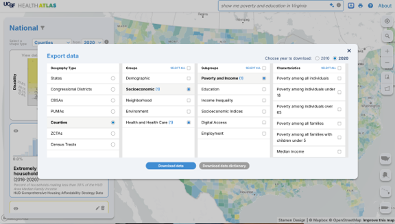
This Health Atlas example provides exactly that kind of environment.
Students can begin with a genuinely important public-health question:
Why do some communities exhibit substantially higher disability prevalence than others?
And immediately, the investigation becomes interdisciplinary.
Now students are talking about:
- education
- poverty
- healthcare access
- geography
- regional history
- public policy
- and socioeconomic inequality
That right there is real data science.
Not because the models are complicated.
But because the questions matter.
________________________________
Sample Learning Objectives for this Lesson
By the end of this lesson, students should be able to:
- Import, clean, and organize publicly available data
- Use visualization as a scientific thinking tool
- Distinguish association from causation
- Interpret statistical models in plain language
- Understand that geography matters
- Appreciate the iterative nature of data science
Import, clean, and organize publicly available data
Students learn that real-world datasets are rarely neat and perfectly labeled. They must inspect variables, identify missingness, interpret documentation, and construct usable analytic tables.
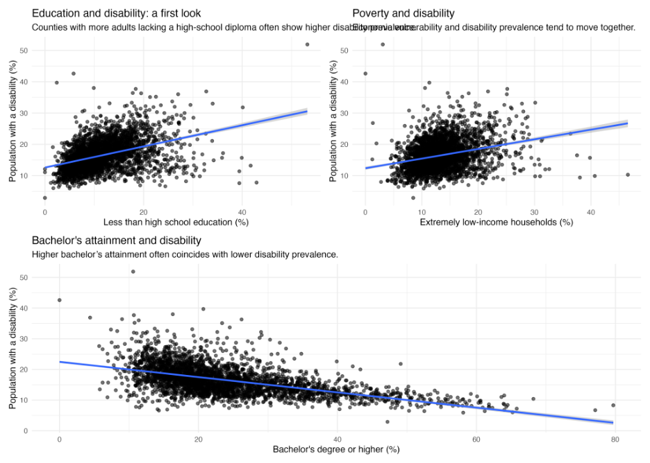
Use visualization as a scientific thinking tool
Students generate histograms, scatterplots, correlation maps, and geographic visualizations to identify patterns before formal modeling begins.
This is enormously important pedagogically.
Visualization is not merely decoration.
Visualization is reasoning.
Distinguish association from causation
Students learn that county-level observational relationships do not imply that one variable directly causes another. Instead, the analysis motivates deeper questions and competing explanations.
Frankly, society could use a LOT more people who understand this distinction.
Interpret statistical models in plain language
Students move beyond simply “running regression” and instead learn to explain what coefficients, predictions, uncertainty, and residuals actually mean in a substantive public-health context.
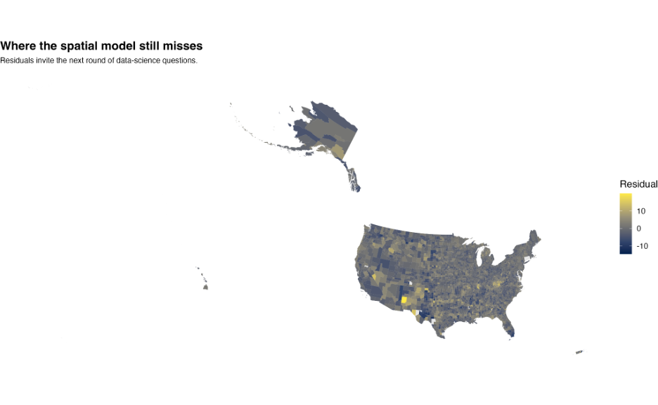
Understand that geography matters
Spatial clustering teaches students that nearby regions often share historical, economic, environmental, and healthcare structures. Students begin recognizing that spatial dependence violates the unrealistic fantasy that all observations are completely independent.
Appreciate the iterative nature of data science
Perhaps most importantly, students learn that a good analysis rarely concludes with:
“We solved it.”
Instead, good analyses end with:
“Now we know what to ask next.”
And honestly, that may be one of the healthiest intellectual habits we can teach anybody.
Because the true spirit of data science is not about worshipping algorithms.
It is about learning how to think carefully in the presence of uncertainty.
_________________________________________
Postscript
What do you think? How would YOU modify this lesson?
Would you change the public-health question? Add additional variables? Introduce different visualizations or modeling approaches? Expand the spatial component? Simplify the statistical modeling? Push students toward deeper policy discussions?
And how do the learning objectives sound to you?
Are they realistic? Too ambitious? Not ambitious enough?
One of the beautiful things about teaching data science is that there is rarely a single “correct” pathway through the data. Every instructor brings a different perspective, a different intuition, and a different set of experiences into the classroom.
So, let’s continue the conversation.
Dr. Stats would truly love to hear your thoughts, suggestions, questions, critiques, and classroom ideas.